4. Render your first screen
This page wires all three runtime pieces:
- a Magic UI Component on an Actor owns the page;
- a Magic UI child inside a Widget Blueprint draws and forwards input; and
- an expose-on-spawn component reference connects those two instances.
The connection is the step most often missed. A Widget Blueprint asset cannot
know which Actor component instance will exist at runtime, so it receives that
reference when Create Widget runs.
A. Create the host Actor
- In
/Game/MagicUI/Blueprints, create an Actor Blueprint namedBP_MagicUIHost. - Open it and select Add Component.
- Search for
Magic UIand add Magic UI Component. - Rename the component variable to
MagicUIComponent. - Select it and configure these first-screen values:
| Property | Value | Why |
|---|---|---|
| HTML Asset | MWA_GettingStarted |
Loads the imported page automatically at BeginPlay. |
| Auto Resize To Screen | On | The logical browser view follows the game/PIE viewport. |
| Auto Match Viewport DPI | On | The backing texture follows the native window scale. |
| Transparent | On | Allows page alpha; an opaque CSS background still renders opaque. |
| Render Mode | Auto (Recommended) | Uses accelerated presentation when available and CPU fallback otherwise. |
| Max FPS | 60 | A sensible first test ceiling. |
HTML File Path still shows the plugin's sample path by default, but the
assigned HTML Asset takes priority. You do not need to clear it.
Do not load the asset a second time
The component calls Load HTML From Asset for its assigned HTML Asset
during BeginPlay. Do not add Initialize UI and another load call to the
Actor's BeginPlay graph. Load functions are for changing content later.
Compile and save the Actor Blueprint, then drag one instance into the level.
B. Build the Canvas and Magic UI widget
- Create User Interface → Widget Blueprint named
WBP_MagicUIScreen. - Open its Designer tab.
- Keep or add a Canvas Panel as the root.
- Search the Palette for
Magic UIand drag the Magic UI widget onto the Canvas Panel. - Rename the child to
MagicUIViewand enable Is Variable. - Select the child and choose the anchor preset that stretches horizontally and vertically.
- Set its Canvas Panel slot offsets—Left, Top, Right, and Bottom—to
0.
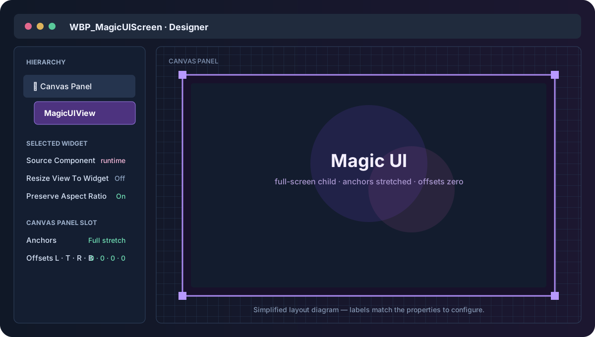
Use these widget settings for the first test:
| Magic UI widget property | Value |
|---|---|
| Source Component | Leave unassigned in the Designer; set it at runtime. |
| Resize View To Widget | Off |
| Preserve Aspect Ratio | On |
| Mouse Input Routing | Always |
| Keyboard Input Routing | Automatic (Recommended) |
Once the page is ready, Always makes this first screen act like a modal menu,
so clicks over the widget go to HTML. Later,
Automatic routing is usually better for a
transparent HUD.
C. Expose the source component to the Widget Blueprint
In WBP_MagicUIScreen:
- Add a variable named
MagicUISource. - Set its type to Magic UI Component Object Reference.
- Enable Instance Editable.
- Enable Expose on Spawn.
- Compile the Widget Blueprint so
Create Widgetcan expose the new pin. - In the Graph, add Event Construct.
- Drag
MagicUIViewinto the graph as Get. - Drag from it and add Set Source Component.
- Connect
MagicUISourceto In Source Component. - Connect the Event Construct execution pin to the setter.
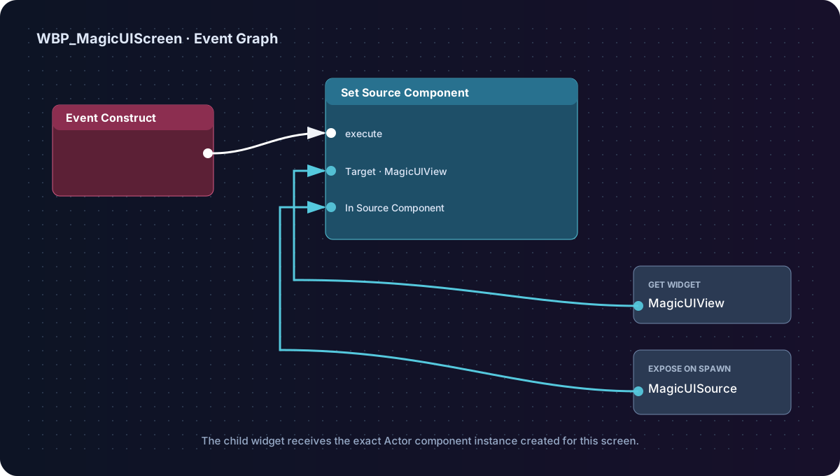
Widget Blueprint graph
Event Construct → MagicUIView: Set Source Component
Data pin: MagicUISource → In Source Component
Compile and save again.
D. Create and display the screen
Return to BP_MagicUIHost and open its Event Graph.
Choose one of the two flows below. Both create the same
WBP_MagicUIScreen instance and pass it the same Magic UI Component. The only
difference is whether you manage viewport/input nodes yourself or let
Toggle Magic UI manage them.
Option 1 — Use the standard viewport and input nodes
Build this BeginPlay flow when you want every presentation step visible and under your direct control:
- Event BeginPlay
- Get Player Controller with Player Index
0 - Create Widget with Class
WBP_MagicUIScreen - Connect the Player Controller to Owning Player
- Connect the Actor's
MagicUIComponentto the exposed Magic UI Source pin - Promote the Return Value to a variable named
ScreenWidget - Call Add to Viewport on
ScreenWidget - Call Set Input Mode Game and UI on the same Player Controller, using
ScreenWidgetas the widget to focus - Call Set Show Mouse Cursor with
true
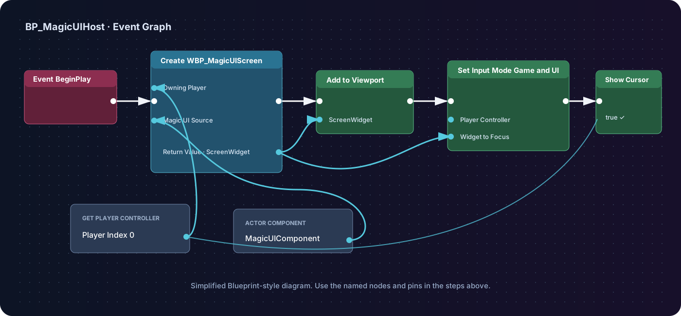
Execution flow
Event BeginPlay → Create Widget (WBP_MagicUIScreen) → Add to Viewport →
Set Input Mode Game and UI → Set Show Mouse Cursor = true
Data flow
Get Player Controller (0)→ Owning Player and input-mode targetMagicUIComponent→ Create Widget's Magic UI Source pin- Create Widget Return Value →
ScreenWidget
Option 2 — Use Toggle Magic UI
Toggle Magic UI is a convenience node on the Magic UI Component. It still needs the widget created first, but it can add that widget to the viewport, apply visibility, select the player input mode, and show the cursor in one call.
Build this alternative BeginPlay flow:
- Event BeginPlay
- Get Player Controller with Player Index
0 - Create Widget with Class
WBP_MagicUIScreen - Connect the Player Controller to Owning Player
- Connect the Actor's
MagicUIComponentto Magic UI Source - Promote the Return Value to
ScreenWidget - Drag in
MagicUIComponentand call Toggle Magic UI - Connect
ScreenWidgetto Widget Reference - Connect the same Player Controller to Player Controller
-
Keep these beginner defaults:
Toggle pin Value Shown Visibility Visible Hidden Visibility Collapsed Input Mode When Shown Game and UI Input Mode When Hidden Game Only Show Mouse Cursor When Shown true Show Mouse Cursor When Hidden false Add to Viewport if Needed true
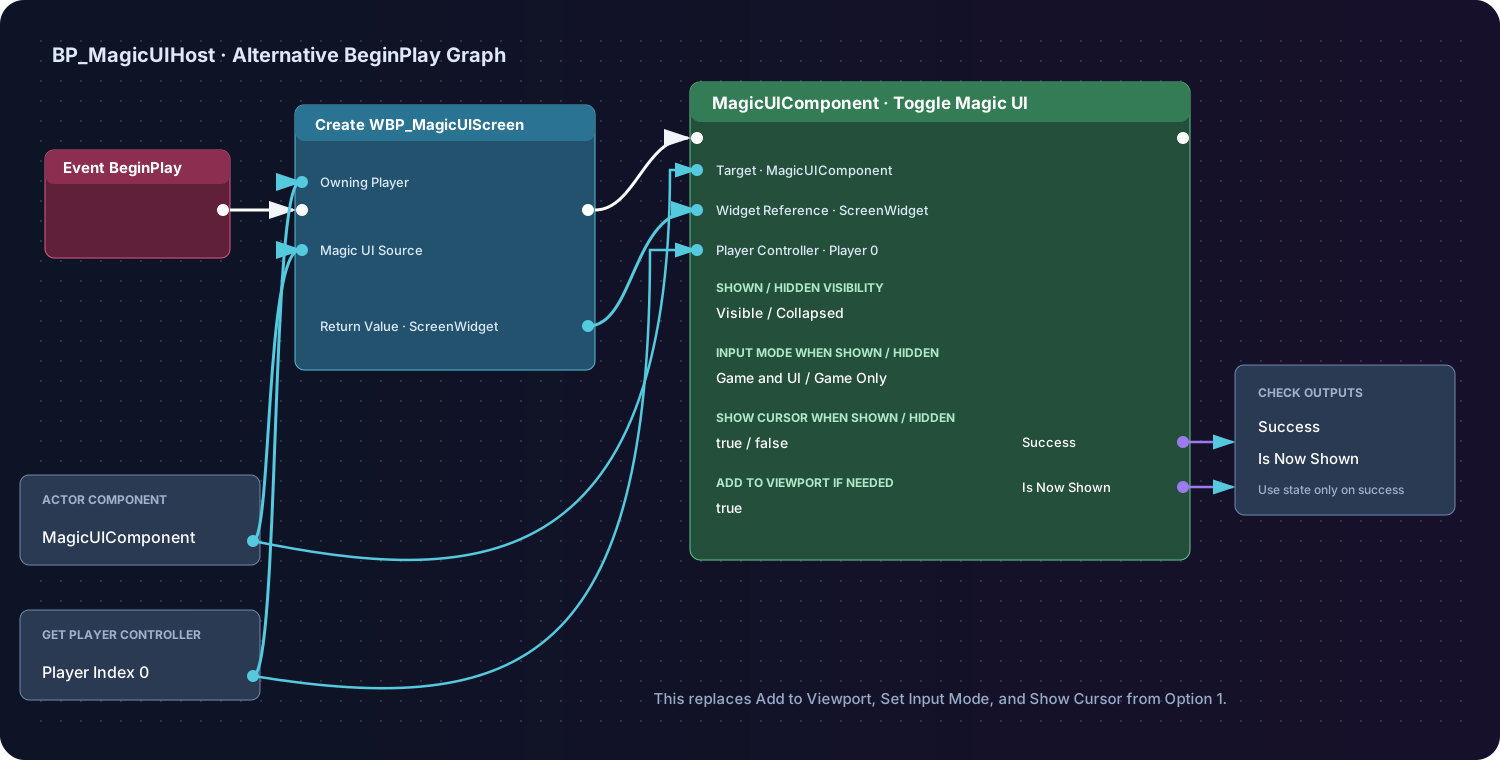
Execution flow
Event BeginPlay → Create Widget (WBP_MagicUIScreen) → Toggle Magic UI
Data flow
MagicUIComponent→ Create Widget's Magic UI Source and the Toggle node targetGet Player Controller (0)→ Owning Player and Player Controller- Create Widget Return Value →
ScreenWidget→ Widget Reference - Success → log or handle a rejected toggle
- Is Now Shown → use only when Success is true
Because the new widget is not yet in the viewport, the first call with Add
to Viewport if Needed = true shows it. Calling the same node later with the
stored ScreenWidget alternates between the shown and collapsed states without
recreating the page.
Do not run both display flows
If you choose Toggle Magic UI, do not also connect Add to Viewport, Set Input Mode Game and UI, and Set Show Mouse Cursor from Option 1. Both options are valid; choose the one that fits the rest of your UI system.
For a menu key that shows and hides this stored widget later, continue with Show and hide a menu.
Compile and save the Actor Blueprint.
E. Add useful load diagnostics
Still in BP_MagicUIHost, select MagicUIComponent in the Components panel.
In Details → Events:
- Add On Page Loaded and connect its URL to a
Print Stringprefixed withMagicUI loaded:; - Add On Load Failed and print the Error in red; and
- Add On Page Message and print
Json Value.
These are asynchronous events. The Actor's BeginPlay finishing does not mean the page has finished loading, and the first rendered texture can arrive slightly after On Page Loaded.
F. Test in PIE
Press Play.
You should see:
- the purple It renders! page filling the viewport;
- a visible mouse cursor;
- a hover color change over the button;
- a
MagicUI loaded:message in the Output Log or screen; and - after clicking the button, a printed JSON value similar to:
The page status should change to Message queued for Unreal.
If the result is blank
Check these in order:
- the placed level Actor is
BP_MagicUIHost; - its component's HTML Asset is
MWA_GettingStarted; Create Widgetreceives that exact component on Magic UI Source;- Event Construct calls
Set Source Componenton theMagicUIViewchild; - the child fills the Canvas Panel;
- On Load Failed did not report a linked-source or bundle error; and
- the plugin is enabled for this project.
The Troubleshooting guide covers runtime and packaged-build failures in more depth.
You now have the reusable base pattern
From here, continue with:
- JavaScript bridge for a reply from Unreal;
- MagicUI Event component for named application events;
- Show and hide a menu for a production-style menu toggle; or
- Web assets before splitting the page into CSS, JavaScript, image, and font files.